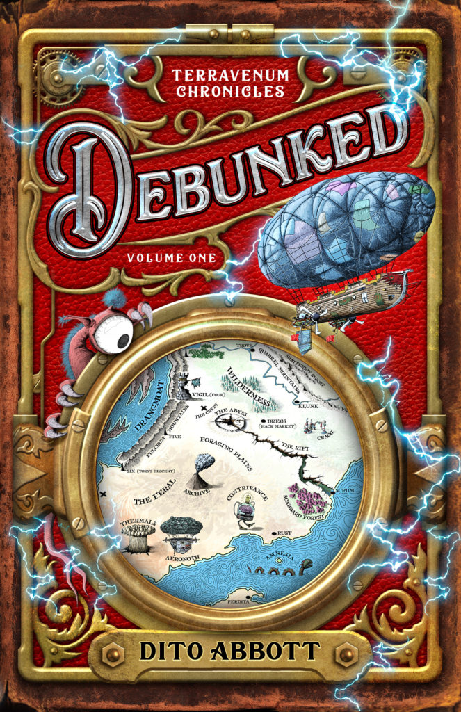
Winner of the SPSFC2 ‘Best Cover’ contest
Dito (dee-toe- rhymes with “Cheetoh”}Abbot was born in Puerto Rico, raised in Saudi Arabia, and lived on a sailboat for the better part of a decade. He wrote his first novel, Debunked, over three years while sailing from Florida to Mexico with his family. Now he lives in the Arizona desert, where he likes to bullseye womp rats in his T-16 in his free time.
We had the pleasure of talking to Dito and cover designer Kirk DouPonce from dogeareddesign.com and fictionartist.com. Take it away Dito:
I’d love to tell you about my cover design process for Debunked. I came across Kirk by accident. He’s well-established in the field, but I wasn’t familiar with his work when I stumbled across a video he made showing his design process for a magazine cover. I was immediately drawn to his creativity and style of blending photography with 3D modeling to create an image of kids riding a pterodactyl. But the thing that really sold me that this was a guy I would like to work with (and this is 100% true, if perhaps not the most reliable predictor of graphic design success) was that he used Europe’s “Final Countdown” as the soundtrack for the project. Anyone who was down with the most epic 80s song of all time was someone I could trust with my cover, if not my life. When he asked me for a copy of Debunked so he could read it for inspiration, he won my heart.
Also, his portfolio was right up my alley, style-wise. But it was mostly about the Countdown.
I’d heard cautionary tales about authors shooting their books in the foot by designing their own covers, so I hoped to stay out of my own way when I began working with Kirk. But since I’m an illustrator and graphic designer, when he asked what I had in mind, I unleashed a firehose of ideas, concepts, and reference art.
Kirk: To jog my memory, I went back and read Dito’s first email inquiry. I remember loving his elevator pitch “Indiana Jones meets Star Wars with a touch of Hitchhiker’s Guide to the Galaxy”. I also loved the map that he had created for the book. However, I had forgotten unitl now that he had also mentioned hiring another designer who didn’t work out. Definitely a red flag. And yet I took the project on. I guess it was his humor that sold me. And that I really wanted to create a cover with a dirigible on it.
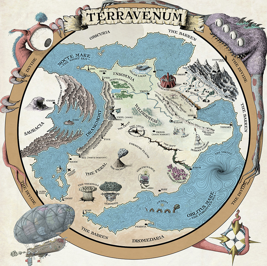
Dito: Buried within the incredibly long chain of emails I sent him were image files of the map I illustrated of Terravenum, the world in my story. I spent a year illustrating that map with vector art, precisely so I’d be able to multipurpose its elements for different media (chapter headings, merch, etc). The map was inspired by old-school charts that featured monsters in the corners, warning of terra incognita. I also illustrated Angelus, the main airship in the story.
Kirk: I read and enjoyed Dito’s manuscipt, there was no lack of imagery to work from! The story is a bit on the complex side, what I had originally contemplated for the cover changed many times. Often I’m able to read a manuscript and have the concept solidified in my head before starting. But not this time. So many possible directions! At some point I remember looking at his map and thinking “well duh, there’s the cover”. The map art had the perfect whimsical flavor the story was begging for. Almost as if the artist knew the story intimately.
I gave Kirk two pitches:
1. To illustrate a specific scene in Debunked (yes, I dove headlong into that classic author trap) that featured two airships locked in a death spiral as they battled inside a volcano. Note: I cast the laws of physics to the wind in favor of awesomeness when I wrote this story.
2. Maybe try something with an old leather book that was covered with metalwork, like Sir Quidby’s much-coveted journal in the story. Adding lightning (called “dynami” in Terravenum) was an additional reference to events in Debunked.
Kirk: When I create covers, I try to remind myself that the art is not for me, it’s for marketing. I need to ask “what is going to attract this product’s demographic”? If you look through my portfolio, I don’t think you’ll find that I have a specific style. But instead I try to achieve whatever is best for each individual book. In this case, Dito’s map was already perfect for the project. So without asking I moved forward creating the cover design around his existing art. I figured the odds of him liking this direction were pretty good. At the same time I didn’t want him to feel jipped. After presenting the cover I told him I’d take half off my original quote. He seemed good with both of those things.
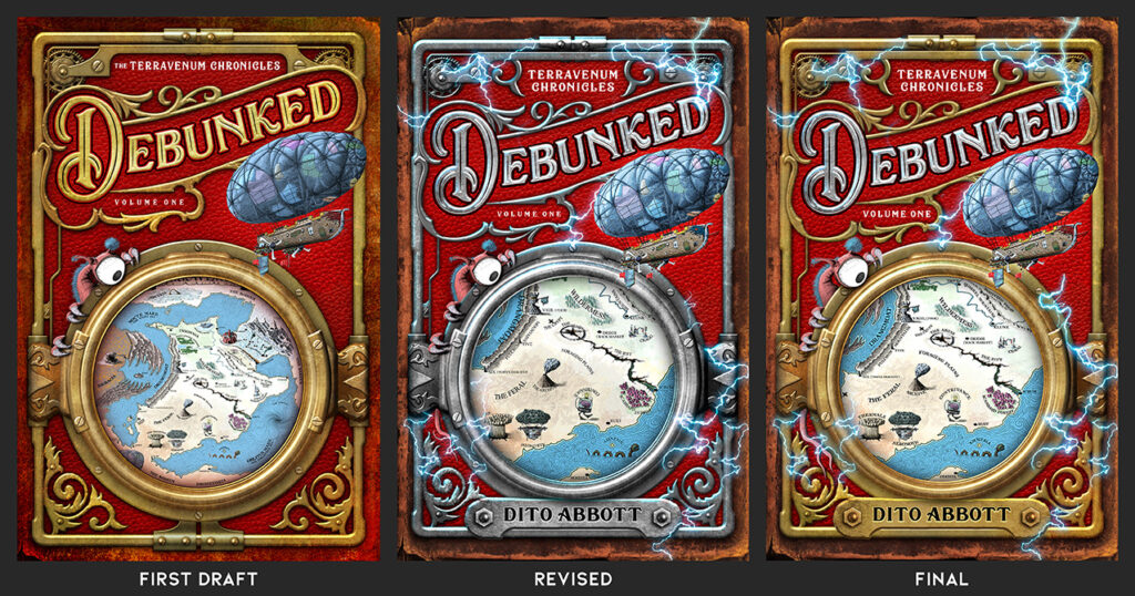
As you can see in the image, there really weren’t a lot of changes from the first draft to the final. Overall a fun experience!
Dito: Kirk nodded, then disappeared for a few weeks. When he came back to me, he presented a concept very similar to Debunked’s final cover. He’d arranged elements I’d illustrated (Angelus, the map, and Steve the monster) to convey whimsy and fantasy in a way I could never have imagined. What’s more, the region of the map within the metal circle focused on the settings unique to this story. Kirk elevated the concept further by laying the groundwork for future volumes in the series. Hopefully, by altering background color, the map region, and focal artwork, we’ll build a cohesive, adventurous brand. His emphasis on theme showed strong instincts for marketing.
Debunked tells an outrageous adventure that careens across genre lines. On paper, it’s a diabolical cover design challenge—one that could only be conquered by an artist who embraces the power of “The Final Countdown”.
We refined the cover through a series of tweaks. I cleaned up my illustrations that he had chosen and we experimented with how much dynami (lightning) to include.
I know this cover competition is only for the front cover, but it’s worth mentioning Kirk’s work on Debunked’s back cover and spine. I once heard him say in a podcast interview that “the purpose of a front cover is to get people to turn over the book and read the back”. It’s worth mentioning that in real world, live event (comic-cons, book festivals, craft fairs) settings, Debunked’s cover does exactly that. (For the curious, Debunked’s back cover features a hand-written letter from Sir Quidby to his grandchildren, then descends into the story blurb. This mirrors the inciting event in the opening scene of the novel)
Dito’s lessons learned working with Kirk on Debunked:
1. This sounds obvious, but choose an artist whose style matches what you hope to achieve. I’ve had unsuccessful partnerships in the past with designers who weren’t a good fit for my particular book, and forcing things didn’t end well.
2. When you hire an experienced professional whose work you love, listen to them. The reverse is also true: an experienced professional should listen to you.
3. When presented with a different concept than you anticipated, take a step back and try to reframe your expectations by asking people you trust what they think about the design before you respond to the designer. I try to take at least one day to mentally process designs before I give feedback, because I tend to overreact. My wife can tell you stories about me staring at gold-colored metalwork vs silver-colored metalwork examples for hours when Kirk and I were nailing down details. If I don’t take time to step back and process, I’m not a good collaborator.
4. A great cover is worth its weight in doubloons. Why go to all the trouble of writing and editing the best book possible, then cut corners with your most important marketing tool? Spend the money. Take the time. Do what you need to do to give your book a chance to shine.
5. A great cover tells readers who love your kind of book that THIS is the book they’re looking for.
Thanks so much for your time, Dito and Kirk!
Be sure to check out DEBUNKED on your favorite book retailer and follow the author here:
http://www.twitter.com/ditoabbott
http://www.instagram.com/ditoabbott
https://www.goodreads.com/author/show/22336195.Dito_Abbott